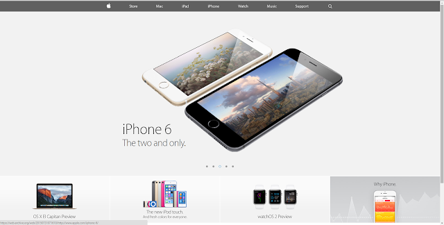
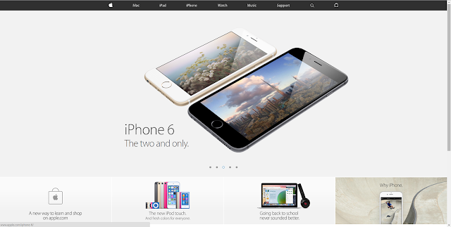
Finally, Apple has unveiled its redesigned website. With the new design, it has now put the lid on the Apple Store from the homepage.
So, Apple has chosen to take off the online shop completely, Now, if users try to search ‘store.apple.com’ then they will be redirected to the homepage instead. Users will find a shopping bag icon on the top of the menu on the right-hand side that will inform them about their order status.
The icon will show products that have been favourited and considering to buy. Once you click on buy, it will display all the configurations to choose from and also the warranty for products.
The accessories page has also been revamped and looks refreshing with new layouts,
The accessories page has also been revamped and looks refreshing with new layouts,
recommendations and categories.
 |
| Before- Apple.Com |
 |
| After- Apple.Com |
Follow ME on Twitter>>> @iamBhavish
And like us on Facebook>>> The Gud1


No comments:
Post a Comment